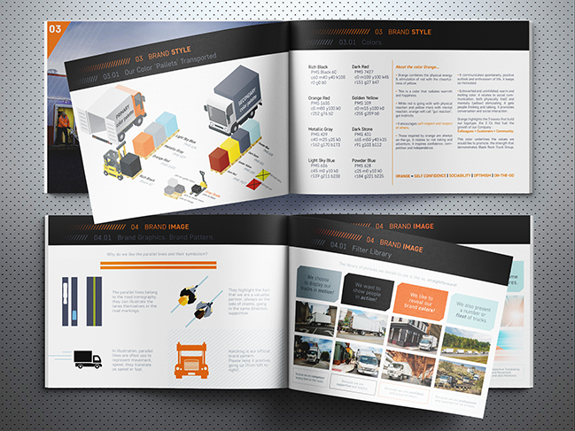
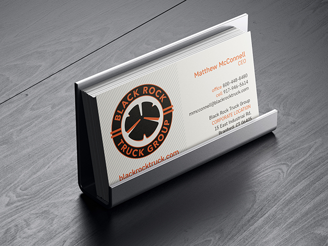
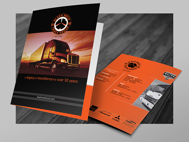
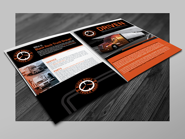
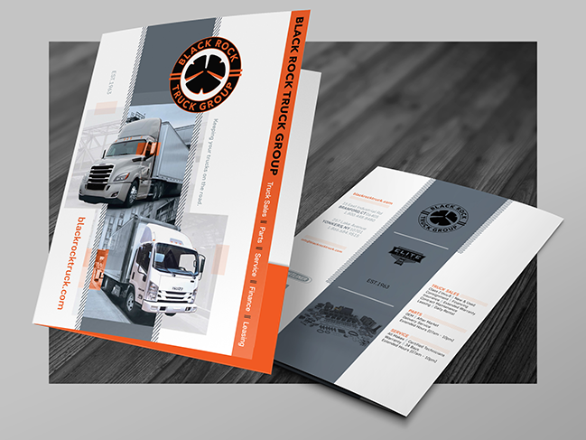
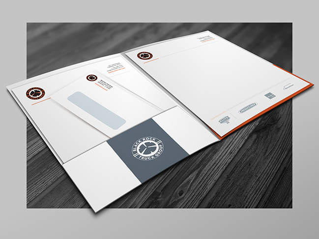
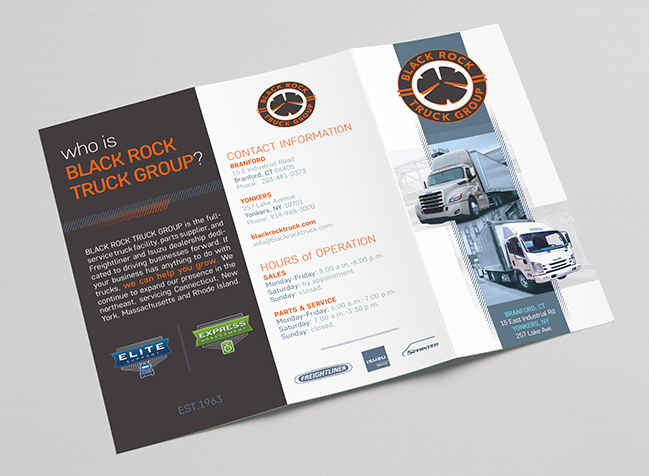
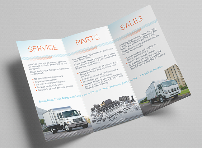
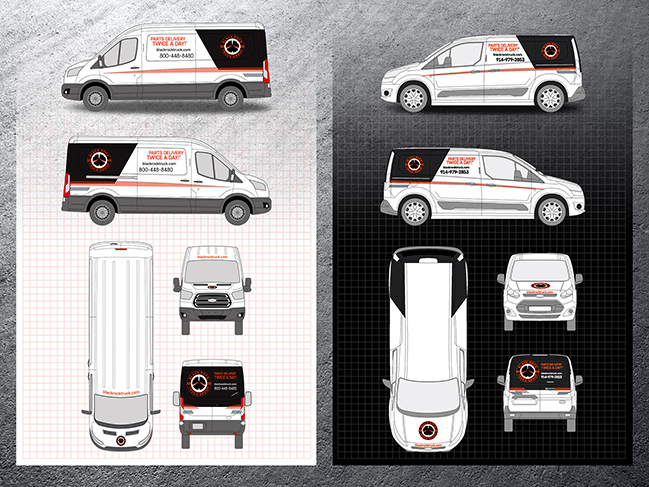
Black Rock Truck Group { Branding }
RAND CLP { Rebranding }
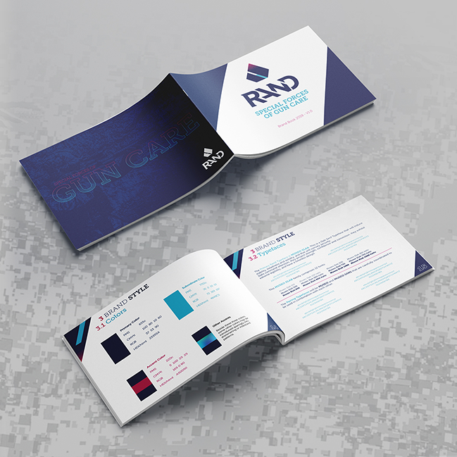
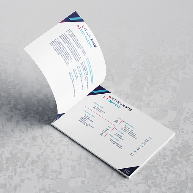
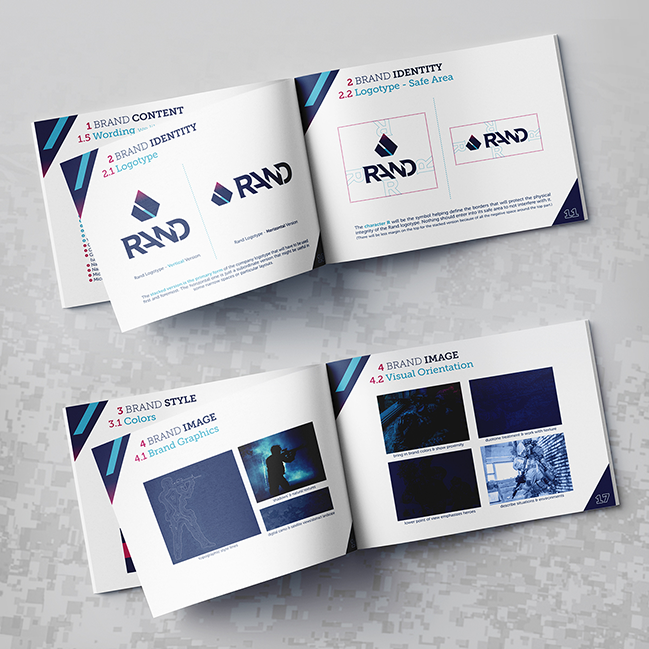
Older Rebranding Projects in France


Logotypes #10 to #18 { Created on this side of the pond }
Logotypes #19 to #27 { Created on the other side of the pond }
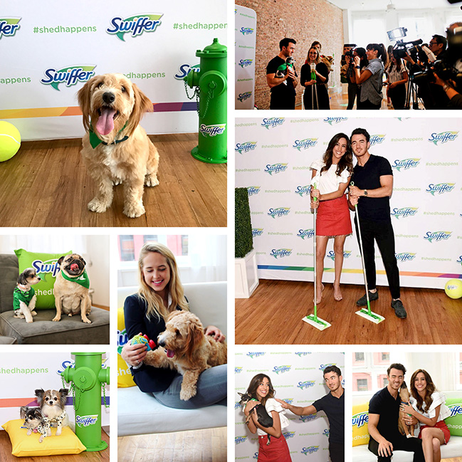
Dawn { Experiential & TV Ad }
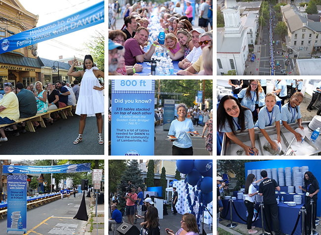
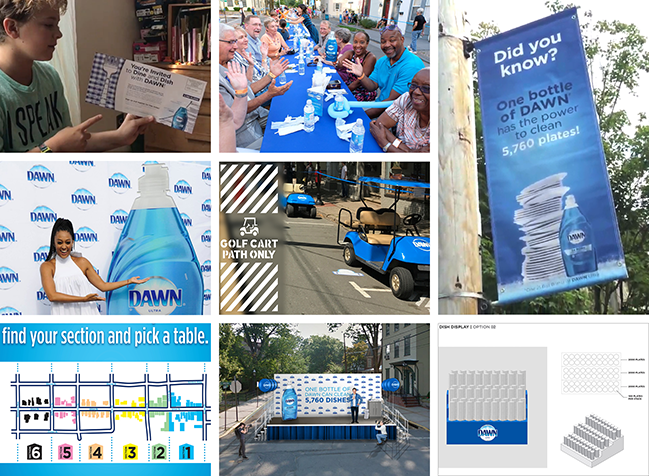
{ Family Dinner with Dawn in Lambertville, NJ on Sunday, August 13, 2017 }
o Dawn Dish Soap brand wanted to have a family dinner for the entire community of an iconic American city.
o The Brand invited all of Lambertville, NJ to dinner and it took on the dishes... that's 5,760 dishes to be exact.
o Dawn also teamed up with actress, producer and author, Tia Mowry.
o Dawn’s concentrated grease cleaning power helps you get through more greasy dishes than the competition.
o Brand & PR mandatory: functional storytelling – not emotional – with focus on mileage superiority.
o One 21.6oz bottle has enough grease-cleaning power to clean the plates of dinner for an entire town.
o Goal: to be bright and impactful - fill the street with Dawn blues and brand logos.
o A TV Ad was shot at that event.
o To make this intimate sit-down dinner as a family a reality, Pinpoint built 2,000 feet of branded picnic table.
o To feed 2,000 people a free 3-course meal, it took 334 tables within 6 city blocks.
o 6,000 plates and 5,000 bottles of water, 200 staff members and 11 golf carts, 250 creative assets were used.
o And... one bottle of Dawn to clean all these dishes!
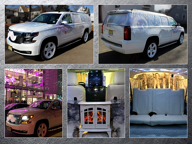
Mastercard & Lyft { Experiential & TV Ad }
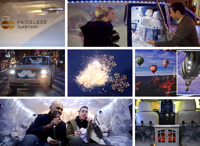
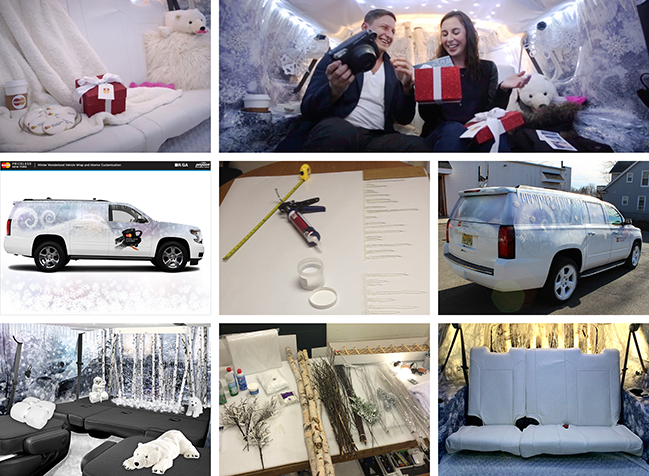
{ Winter Wonderland Vehicle Wrap & Interior Customization - December 2014 }
o Mastercard & Lyft partnered around the holiday season to create a magical evening in NYC.
o What happened that night was an unforgettable surprise for the Mastercard cardholders!
o This was a collaboration with Octagon & R/GA.
o Pinpoint was approached to convert the outside & inside of a Lyft SUV into a “Magical Winter Wonderland”.
o For one night, it went to pick up unexpected cardholders and really give them a Priceless Surprise.
o Personal ride, concert tickets, shopping spree at Time Warner Center, dinner and goodies.
o Simply put, the experience was magical!
o A TV ad was shot that night and then aired nationally.
o It was featured on ABC only a minute after the ball dropped on New Year's Eve.
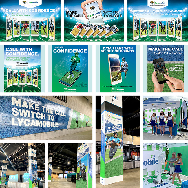
Fanduel { Brand Awareness }
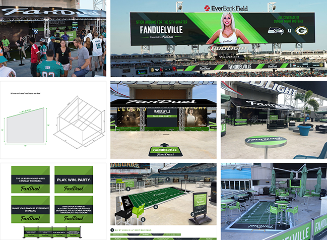
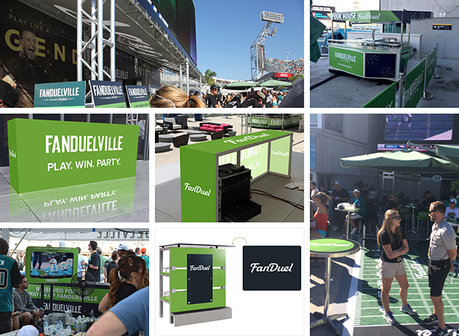
{ Brand Activation in Jacksonville, FL on September 20, 2015 - Jacksonville Jaguars vs. Miami Dolphins }
o What better place is there to interact with football and fantasy sports fans than at an NFL stadium?
o Objective: raise brand awareness, enroll new users, and promote consumer engagement.
o FanDuel was faced with having to produce several brand-centric areas for the 2015 season.
o They turned to Pinpoint to design, create, build and install an immersive consumer experience.
o Overarching solution: create FanDuelVille - multiple FanDuel-branded footprints throughout the stadium.
o The Reward Zone, The VIP Club, and The Mayor’s Cabana were designed to engage the target consumers.
o These in-stadium footprints accommodated over 3,000 fans during each Jacksonville Jaguars home game.
o The brand exposure has been huge and the overall project was a big success for the entire season.
Mastercard { Brand Activation }
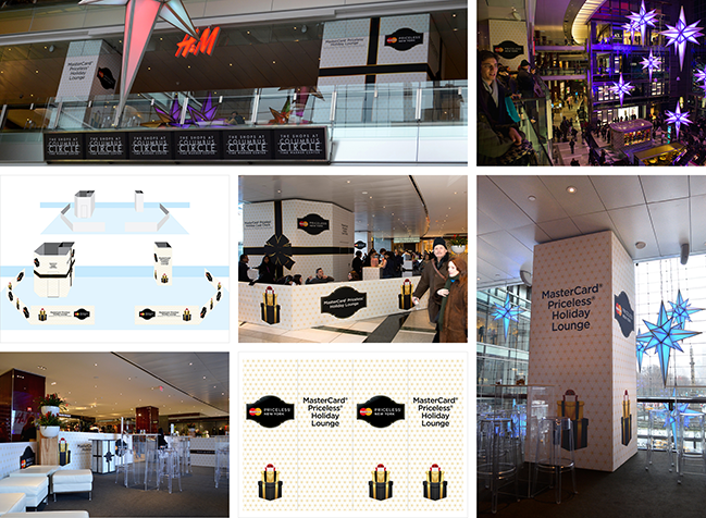
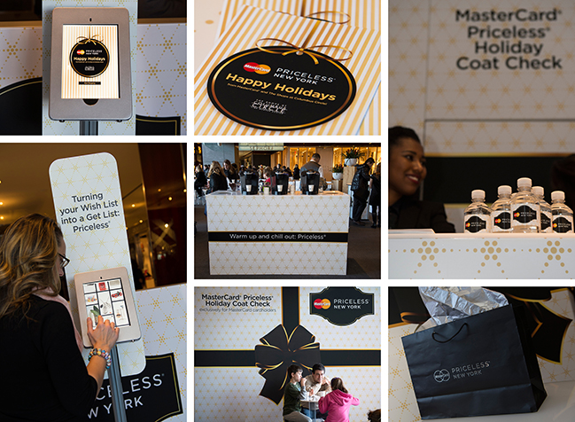
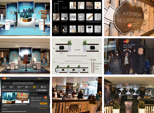
{ Mastercard Holiday Lounge - Holiday Activation at The Shops At Columbus Circle on December 2014 }
o Mastercard & Time Warner Center in NYC partnered to provide cardholders with a premium experience.
o Near the iconic holiday light-up star display, they could find a branded Holiday Lounge to relax in.
o This footprint took place on the second floor overlooking views of NYC.
o The Holiday Lounge provided a festive, comfortable environment for busy holiday shoppers to unwind.
o The entire month of December, guests were able to enjoy various Priceless rewards from MasterCard.
o One of the perks was that these guests were able to build their own personalized Holiday Wish List.
o The cardholders could share it with family and friends through e-mail and social media platforms.
o Outcome: 14,500+ visitors - 1,480 holiday wish lists created - 6,000+ promotional products distributed.
o 3rd part, left column: "Priceless Holiday Workshop" - the 2013 footprint (not the lounge yet).
o 3rd part, middle and right columns: "Enchanted Birchwood Forest" - the 2015 footprint.
o In 2016 "#Priceless Holiday" kept the successful 2015 concept, furniture was changed to black (last pic).
iHeartMedia { Sponsorship Activation }
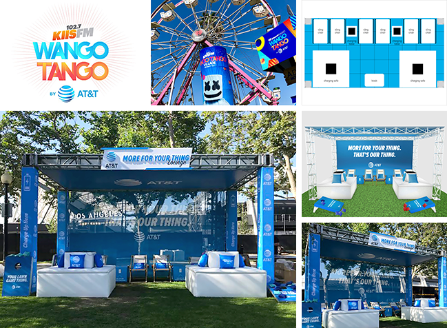
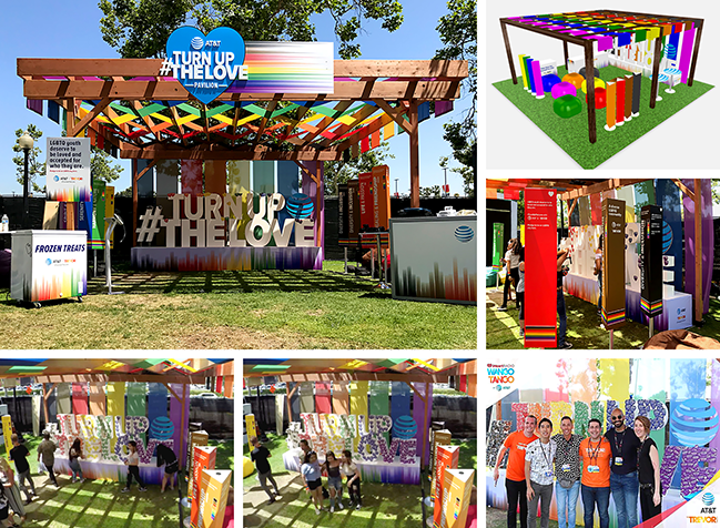
{ iHeartRadio KIIS FM Wango Tango by AT&T in Los Angeles, CA on Saturday, June 2, 2018 }
o Two sponsorship activation footprints in the Wango Tango Village at Banc of California Stadium.
o Goal: reinforce AT&T's history of promoting diversity and support to the LGBTQ community.
o Core of the messenging: advocate for AT&T's partnership and commitment to The Trevor Project.
o The "MORE OF YOUR THING" lounge invited attendees to relax and recharge within the daytime village.
o 20'x10' truss structure with branded canopy and backwall around charging sofas and charging tables.
o Lounge chairs with branded pillows and custom bag toss game under a dimensional sign."
o The "#TURN UP THE LOVE" pergola with the rainbow colors weaved into the 20'x20' wood structure.
o Designed to let fans become supportive allies - fill out message hearts and stick them on foam letters.
o This 17'x6' custom structure was then used as a photo opportunity for the concert goers.
o Spinning signs to educate the attendees in decoding the colors of the rainbow flag.
o Branded kiosks, custom freezers, and colorful bean bag chairs to welcome the fans.
o Rainbow themed promo items and giveaways.
Mastercard & American Airlines { Brand Activation }
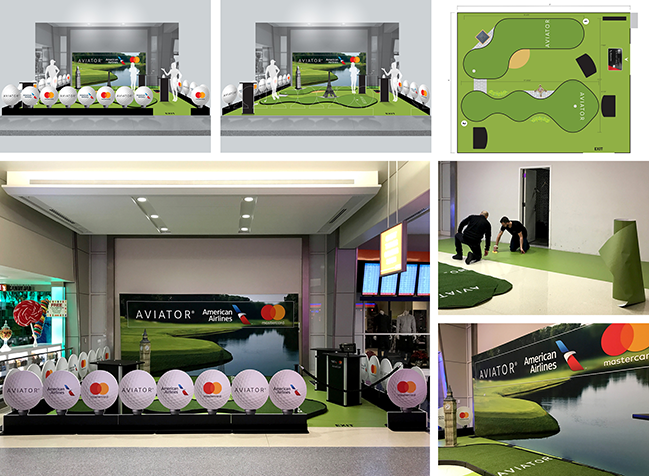
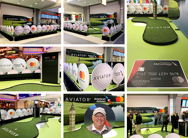
{ Dallas/Fort Worth Airport American Airlines Terminal, November 2017, Monday 13 to Thursday 16 }
o 4 activation days to drive awareness and increase in-airport card acquisition.
o Mastercard and American Airlines activated an interactive putting green activation inside the DFW Airport.
o Goal: reward AAdvantage Aviator cardmembers and drive in-airport acquisition.
o Existing cardmembers could engage with a putting green experience.
o Not cardmembers were encouraged to talk with American Airlines representative to sign up.
o Golfing instructions were receieved from PGA Teaching Professional - Mark O'Meara.
o 20'x20' activation footprint with two elevated putting greens for consumers to receive lessons.
o Choice to have water on the media wall to highlight flights going across "the pond" to airports in Europe.
o Custom golf ball fence - Life size Eiffel Tower & Big Ben - Branded kiosks - AAdvantage card ground graphic.
Crest { Crest 3D White / Whitening Therapy - Product Launch }
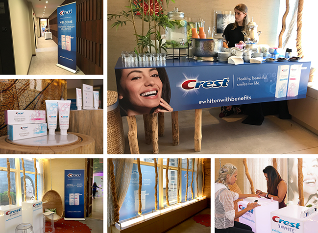
{ Event for NYC based beauty influencers, held at Exhale Gym [Manhattan House condos] on Sep. 6, 2017 }
o Concept: merge both beauty and health - showcase added health benefits of the paste strengthening enamel.
o Session with a dental expert, core fusion barre class, manicures and chair massages.
o Desired outcome: teach guests about the new product and what sets it apart from other whitening pastes.
o Design an environment within the tone of credible and professional - Make the brand to come off as a leader.
o Utilize the product packaging for design elements to be featured on signage was a request from PR company.
o Ensure a fulfilling experience to get social and traditional media impressions at the event and post event."
o Focus point: a dimensional wall with lighting for influencers' photo opportunity.
o Custom Product display island for the dental expert session and table sets for manicure.
o Branding across the environment: welcome bar, rollup banners, window vinyl, sampling boxes and displays.
Crest { Product Promotion }
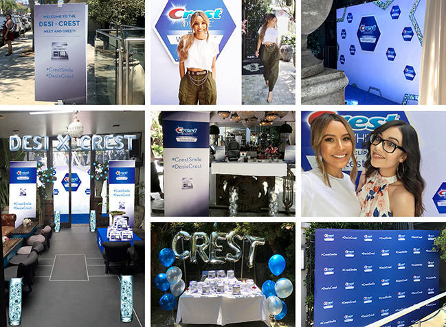
{ Desi Perkins at Pump Restaurant Lounge in West Hollywood, CA on Wednesday, June 28, 2017 }
o Promote Crest 3D WHite / No Slip WHite Strips through a meet & greet and DesixCrest Sweepstakes.
o To attract influencers, Crest gave away 10 of Desi's Summer Favorite Prize Packs.
o To enter: post a photo and drive followers to a link for savings on the product.
o Focus point of this environment: a dimensional wall with some iridescent parts.
o Echoing these iridescent parts, vases filled with disco balls ornaments lead the way to the wall.
o Clean and simple branding within the environment: signs, rollup banners, step & repeat, table covers, flyers.
Brisk { New Product Launch Party }
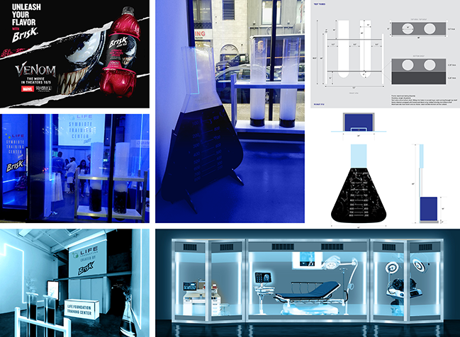
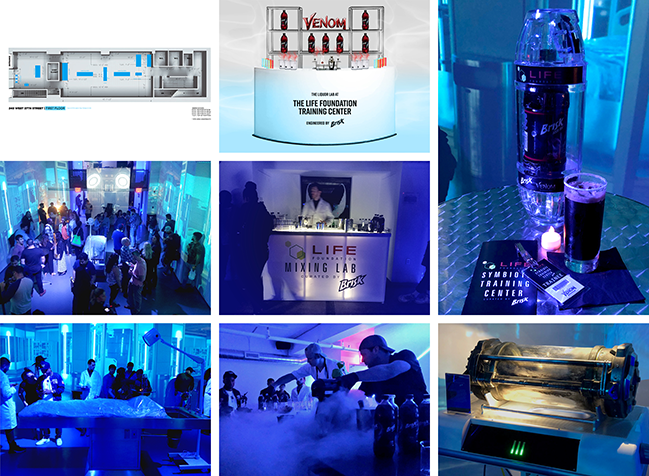
{ Brisk/Venom at LIGHTBOX [248 WEST 37TH STREET] in New York City, NY on Thursday, October 4, 2018 }
o BRISK took on supervillains with Marvel's VENOM [Sony Pictures Releasing] hitting theaters October 5, 2018.
o Media, selected influencers and movie tickets winners were invited to discover a Brisk limited edition.
o To launch Brisk Symbiotic Dark Cherry Limeade we "recreated" the Life Foundation Symbiote Training Center.
o For the entrance, we built the life size beaker test tubes with black liquid and smoke to set the atmosphere.
o The lab was designed with rented elements, real props from the movie and video projection on walls.
o To sample the new flavor we had branded coolers, a custom mixing lab, a bar, and scientists serving in lab coat.
Verizon Up { Manhattan Center Concert }
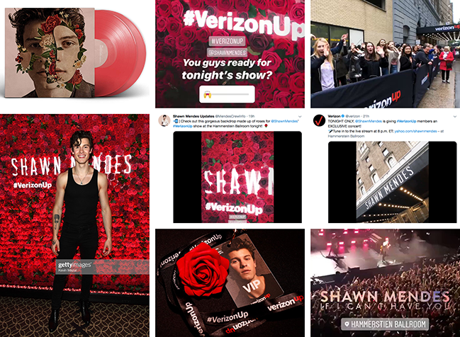
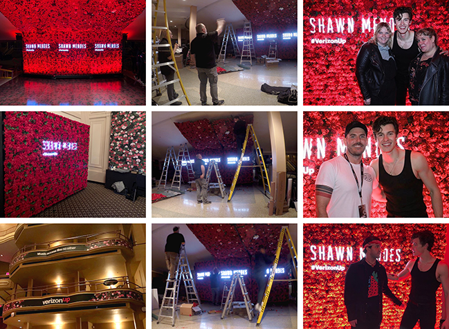
{ Shawn Mendes Private Concert at Hammerstein Ballroom in New York City, NY on Thursday, May 14, 2019 }
o Momentum Worldwide approached Pinpoint for a surprise concert prepared by Verizon for their customers.
o 2,000 lucky members of Verizon Up were treated to an exclusive members only concert with the pop superstar.
o Shawn Mendes' album cover ended up giving the direction for the art direction: the roses, and a lot of them!
o Over 14,000 flowers for a wall and a ceiling, floor graphics and led signs created a photo opp for the fans.
o A smaller flower wall was created as a backdrop for Select Verizon Up Members invited to a meet & greet.
o Fans shared Instagram photos showcasing these walls, and the event reached 191M impressions!
o With 695+ reach, this Verizon Up concert became the most talked about moment in Verizon Up history.
o From designing in the office to being part of the team on site, I made sure we "created remarkable".
o Seen here trouble-shooting with the Signage Manager or an Production Assistant and working on these walls.
1800 Tequila { "1800 Rooftop" - Sponsorship Activation }
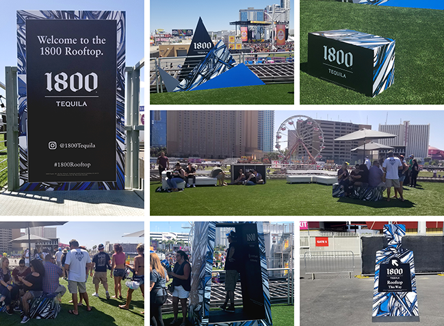
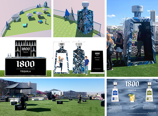
{ On-site presence at iHeartRadio Music Festival in Las Vegas, NV - September 2018, Friday 21 to Saturday 22 }
o iHeartMedia tasked Pinpoint with the design, fabrication and installation of a 65'x65' activation footprint.
o Elevated on the top of the barrel within the Festival Grounds, the space was in direct sight line of the stage.
o The 1800 Tequila Tasting Lounge had to make a connection between the brand and the urban music space.
o Festival goers could find shelter from the sun on custom seating, under umbrellas and between misters.
o In addition of the seating to relax, two branded tasting bars: sampling had to be a key part of the experience.
o A photo opp was designed to mimic the distinctive shape of their bottle with graffitis in the brand colors.
Macy's { iHeartRadio Music Festival Partnership }
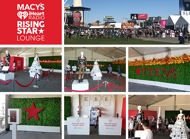
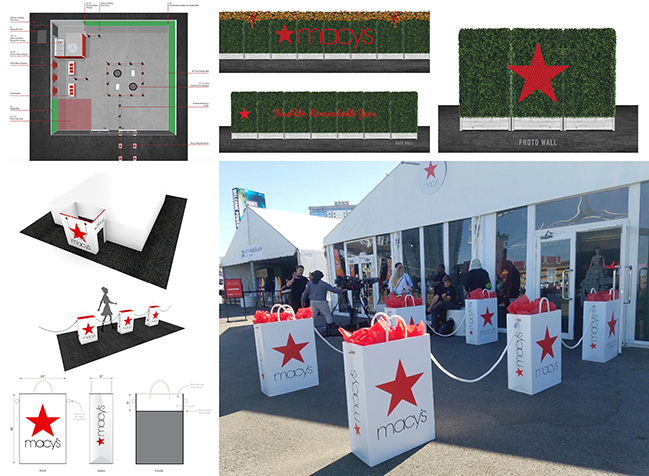
{ "Find Your Remarkable You" at iHeartRadio Music Festival in Las Vegas, NV - September 2018, 21 & 22}
o Macy's - a long-standing partner of the Festival - has provided year over year custom t-shirts.
o The client was looking for an engaging experience while consumers were waiting in line for the premium items.
o Goal: provide credibility to the website The Edit (tagline "Remarkably You") & make Macy's a fashion authority.
o Festival goers were drawn to the activation footprint by creative stanchions: some oversized Macy's bags!
o They could take pictures in front of hedge walls with Macy's logo made of flowers, neon sign, or a red star.
o We had the fashion designer Garo Sparo work on two creations for Macy's connecting fashion and music.
Additional Mock-up Proofs
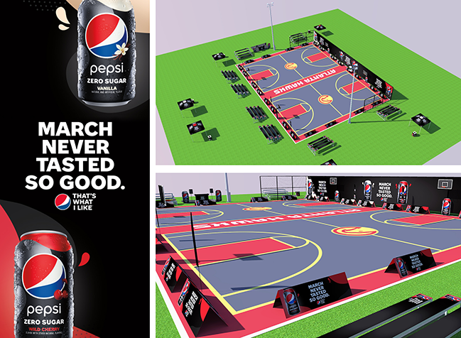
{ iHeartMedia / Pepsi - March Never Tasted So Good }
o Event was planned for April 4th, 2020 in Central Park, Atlanta, GA.
o Activation campaign for 2 new products: Pepsi Zero Sugar Vanilla & Pepsi Zero Sugar Wild Cherry.
o Fence banners, sideline A-frames, die-cut Pepsi cans, branded bleachers, tents, feather flags, garbage cans...
o Due to concerns over Covid-19, this event has been canceled.
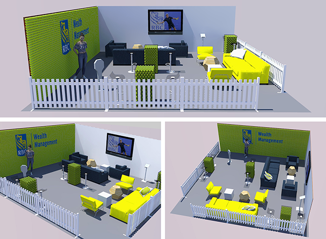
{ RBC Wealth Management - Lounge Area}
o Pinpoint created some signage and worked on some promo items for the RBC Tennis Championships of Dallas.
o The agency was then approached to present some ideation for a 20'x20' lounge area for this tournament.
o This is a proposition I came up to for the 24th tournament in 2121 (budget was closed for the 23rd edition).
o Focus points: wall made of tennis balls with logo for photo opportunity & custom tables filled with tennis balls.
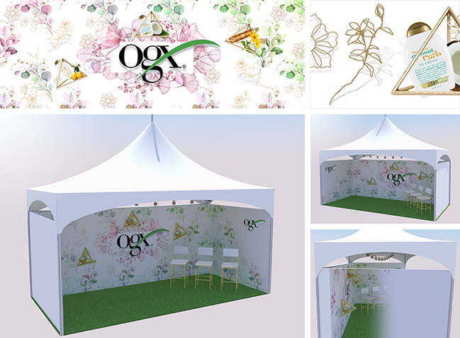
{ iHeartMedia / OGX - Governors Ball Music Festival }
o Event was planned at Randall’s Island Park in New York City, June 5th-7th, 2020.
o This 20'x10' tent would have been OGX Social Beauty Corner for having some interviews.
o Hero wall shows watercolors leaves, flowers, and fruits in the brand colors, with dimensional gold elements.
o Due to concerns over the coronavirus, Governors Ball 2020 has been canceled.
{ Pinpoint / Experiential Marketing and Production Capabilities Pitch Deck }
o Presentation renderings made for iHeartMedia for some sponsorships at their Las Vegas Music Festival.
Larivière { 292 page catalog }
{ Specialized distributor of roof covering products and materials }
o 110 depots in France, 400 suppliers, 23 000 clients.
o 2010/2011: I had to present their complete range of products dedicated to roofing professionals.
o I had to wear 4 hats through that project:
o Art Director (creation + managment of the graphics designers)
- give its look and feel to the catalogue,
- design cover and double pages introducing each section,
- create catalogue overview, products overview, corporate pages, etc.
o Creation Director Assistant (without my signature, no page could leave to the client).
o Project Manager Assistant (a page could enter in production only if I checked client's need).
o Engineer Assistant (to develop specific content delivering and feed-back tools).
Nobilia { 52 page product scope catalog }
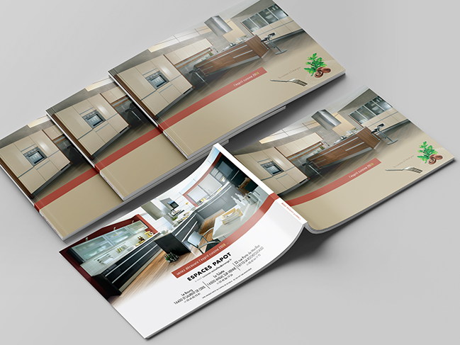
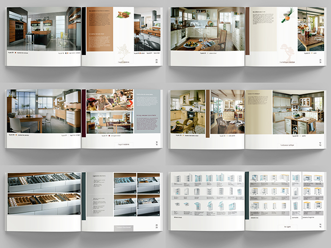
{ German Nobilia is the largest kitchen manufacturer in Europe }
o 535,000 complete kitchens produced in 2011.
o Every third kitchen sold in Germany is a Nobilia kitchen. Export quota is 38.2 %.
o My brief: give another image to the 'Nobilia kitchen journal' (in 2008 & 2009).
o New presentation of the current collection for some trade partners in France.
o The catalog (A4 landscape closed) presents the diversity of the current range.
o Gave the title: " l'esprit cuisine 2008 " (kitchen spirit 2008).
o Added an advertising teaser: " la cuisine à l'état pur " (the kitchen in its pure form).
o Chose a refined and sober layout blending perfectly with the lines of these german kitchens.
o Punctuated the catalog with 'food illustrations' inspired from japanese zen tradition.
Team Espace Power { booklet }
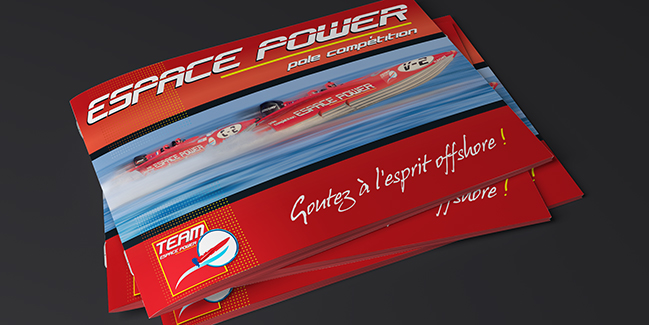
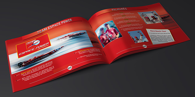
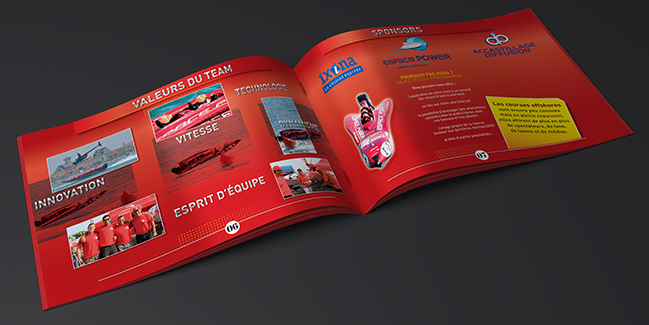
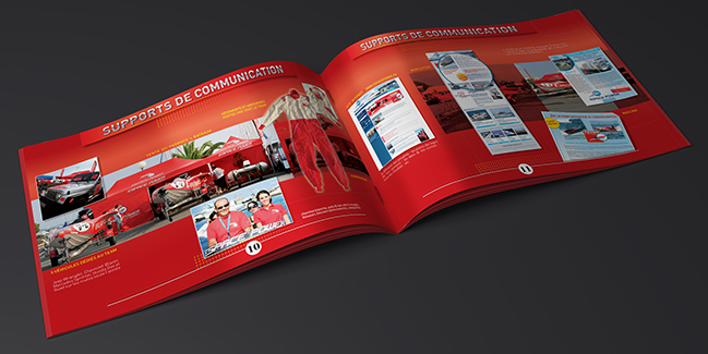
{ Full service boat dealership (yachts and boats) in the south of France }
o A commited team: some of the staff members have experience in off-shore racing.
o The Team Espace Power: 2 boats in 2 different power classes with 2 crews of 2.
o France champions in 2006, 2008 and 2010!
o Booklet [10 x 6" closed / 20 x 6" spread] for their sponsors research.
o Red color of the team and the boats was obviously a good choice.
o It conveys the symbolisms of strength, of power, of passion...
o Red background with duotone pictures: the pics with blue sea really stands out.
o Cover characters wrapped in chrome for the mechanical part.
o Graphic pattern with yellow dots to underline the concepts of speed and energy.
o Hand writing typeface to give a balance with a human touch (crews & future partnerships).
DEXIA { communication booklets }
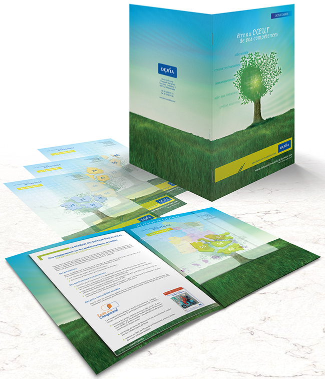
{ Dexia ranks among the 20 largest banks in Euroland }
o Worlwide leadership in Public Project Finance.
o Among the top 5 biggest issuers in the private sector of long-term debt in the world.
o The only bank dedicated to European local authorities active on the bond market.
o Extensive network through 300 regional experts in France.
o Set of booklets to assist these experts into their communication with clients/prospects.
o Each one is stapled into a folder tailored to each region with a translucent paper data sheet.
o Trees highlight the institutional brand motto "no achievement without lasting commitment".
o Providing short and clear informations for straightforward communication.
o Use a wide range of tools to transmit the message: texts, pictures, graphs, diagrams, etc.
S.E.A.F. { educational outreach }
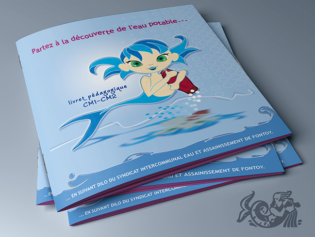
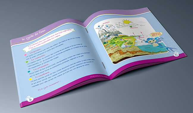
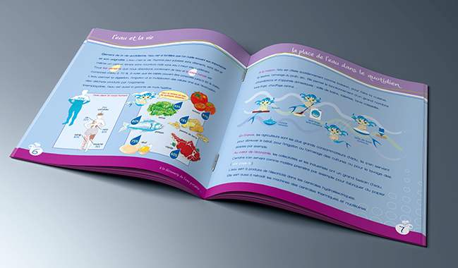
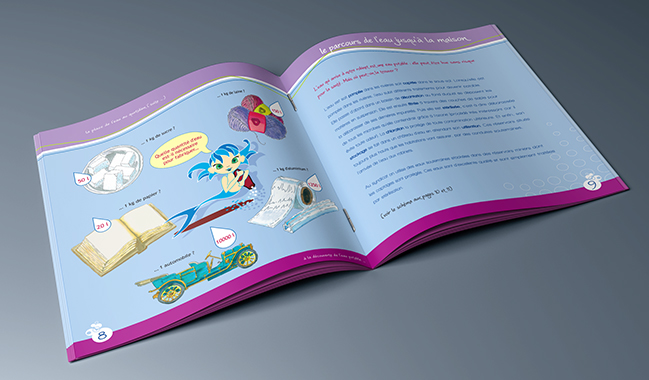
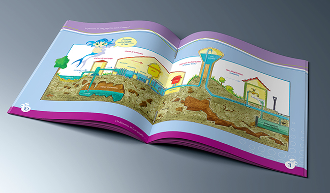
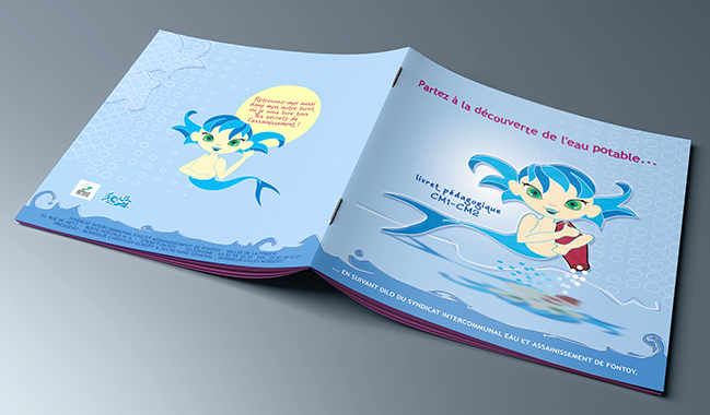
o Educational booklet for the anniversary of a local water authority.
o Explain to children aged 9-10 water supplying and sewerage systems.
o Design a manga-style character based on the agency logotype.
o Traditional marker illustrations give another level of information.
o Balance between the digital illustrations and hand-drawn ones.
o Naming the little teacher Dilo, sounds as "Dit l'eau" in French (Tell the water).
Mastercard { photocards }
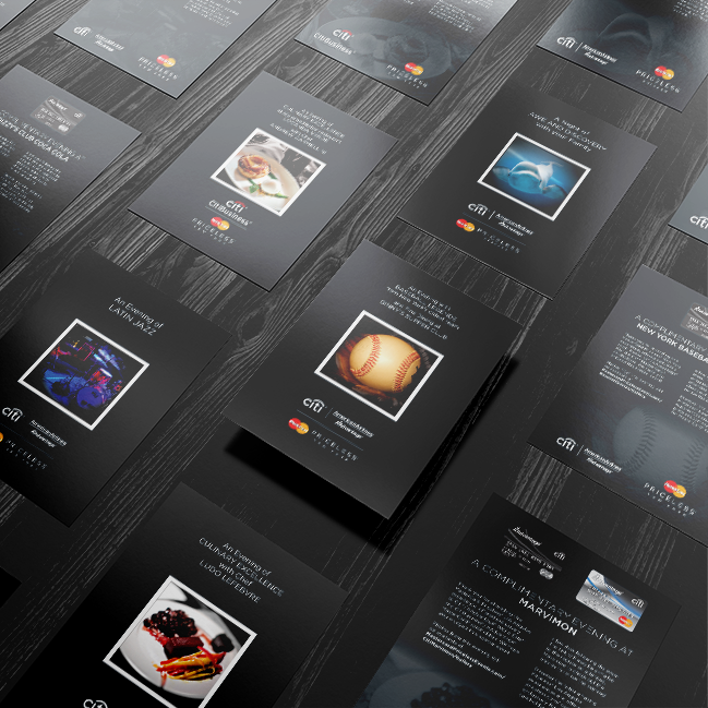
{ Collection of cards designed for Mastercard Priceless Cities Events }
o The photocards were given to the Mastercard cardholders as a thank you card.
o They invited to check out the photos of the event online the following day.
o They also promoted the website priceless.com with its offers and experiences.
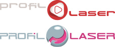
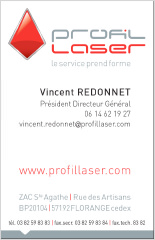
Profil Laser { corporate brochure }
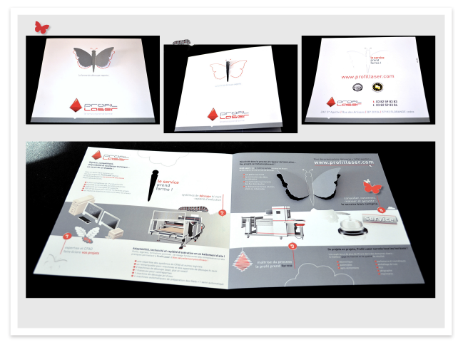
{ Cutting die & associate tools manufacturer with 25+ years of expertise }
o One of the leaders in France (flat bed cutting tools top 10, rotary cutting dies top 3).
o New logotype (see [logotype] section) signing new physical and electronic images.
o Gave an industrial/technical dimension away from its former label as 'small craftsmen'.
o Decided to soften the technical image with a more poetic picture: concept of butterfly.
o The butterfly evolution steps underline the steps in the creation of a cutting tool.
o Butterfly wings are cut on 3rd panel and go through the caterpillar body cut on 1st panel.
o They keep the brochure closed. On 4th panel they let see the new brand motto inside.
o Balance butterfly/machines evokating balance between machines and people using them.
o Gray for their technical expertise, red for their life-blood: know-how + service quality.
Metz // LQA { information brochure }
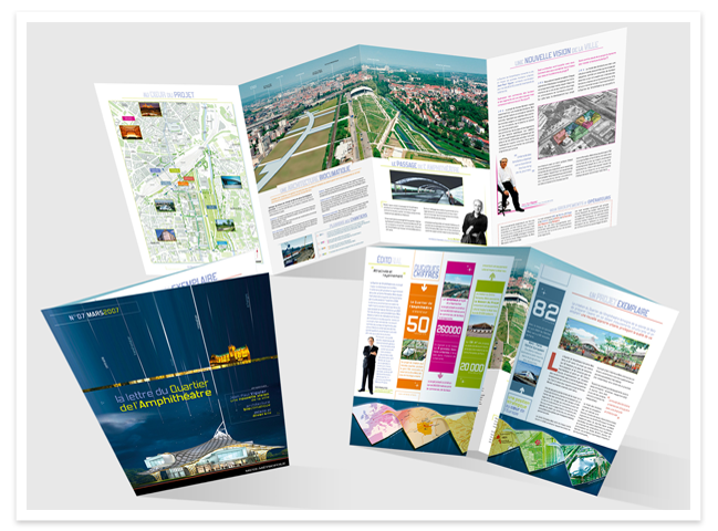
{ Lettre du Quartier de l'Amphithéâtre for City Planning Project }
o Metz - East of France - 125 000 people (up to 240 000 within Metz Metropole).
o Project managed by the famous architect/city planner Nicolas Michelin.
o Heart of the area is the museum with collections from Pompidou Center in Paris.
o The city hall communication staff asked for a new ‘letter’ following the works.
o The target of this ‘letter’ was mainly investors for retail property.
o Won this tender operation with this double gate fold brochure (one panel is A4).
o Cover pictures by night: the project will enter into the dawn of a new day…
o When unfolding, the 1st information is key figures, strong signal to investors.
o Testimonials of the major players of this project humanise the informations.
Luxembourg ECOC 2007 { event calendars }
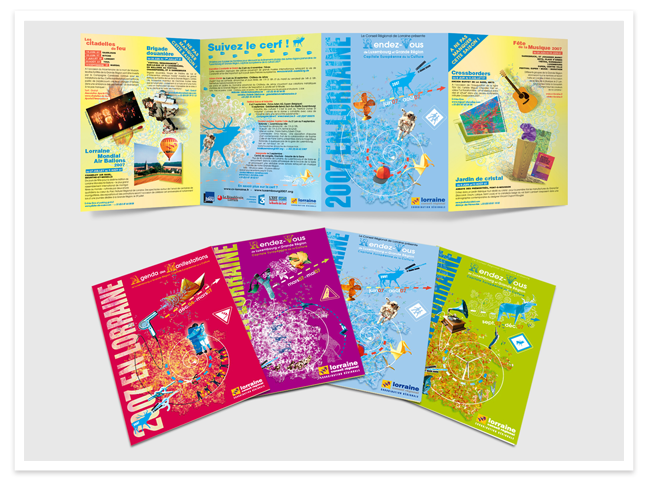
{ European Capital Of Culture (ECOC) }
o Created in 1985, the concept of ECOC has to meet two requirements:
- developing a high quality and innovative artistic programme,
- advancing the cultural creation of the cities with unusual projects.
o Luxembourg & Greater Region, ECOC 2007: the 1st time a whole region assumed this title.
o Five themes acted as the guiding principles: 'migration' (Luxembourg),
- 'places of memory to be places of tomorrow' (Lorraine), 'industrial heritage' (Saarland),
- 'European characters' (Rhineland-Palatinate), 'modern expressions of culture' (Wallonia).
o The art direction for the French region (Lorraine) was entrusted to me.
o To express the numerous projects, I did set an aesthetic originating in Maximalism.
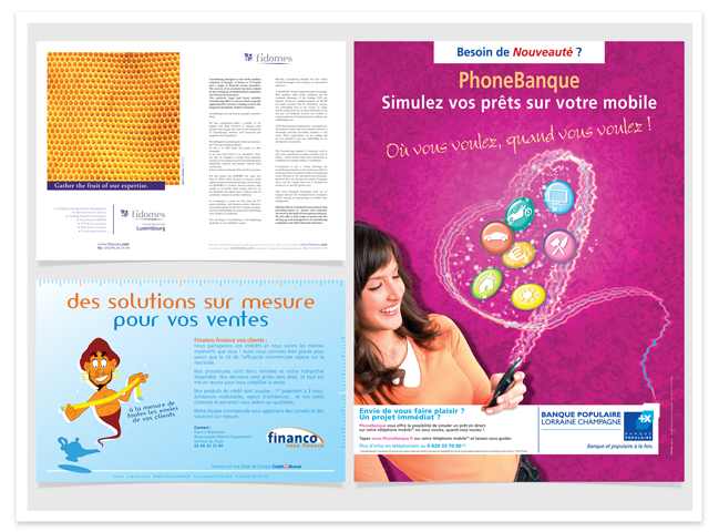
BPLC { financial product leaflets }
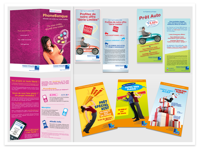
{ Banques Populaires: 4th banking network in France }
o BPLC: Banque Populaire Lorraine Champagne.
o This is one of their 17 regional divisions.
o ACEF is a savings & loans association for public sector employees.
o PhoneBanque: a leaflet introducing a new loan simulation on mobile phone.
o Leaflet for a special car loan 'Paris Motor Show' (loan+insurance).
o Car loan with same design according to the success of the previous one.
o 3 leaflets for personal loans with campaign theme: 'Indulge yourselves!'.
o Usual format for the French leaflets: 100x210 mm (1/3 A4), about 4"x8".
o Displayed in counter standings or wall mounted holders in the agencies.
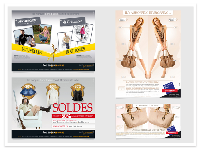
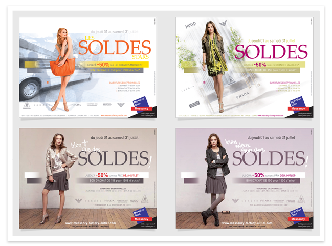
McArthurGlen { store directory }
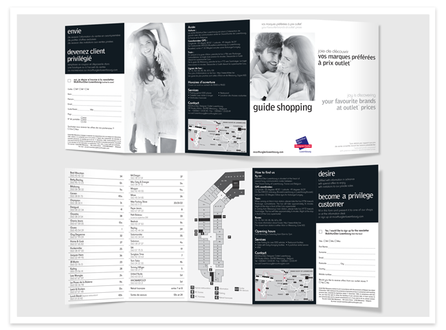
{ Designer Outlet Retailing }
o Leading owner, developer and manager of designer outlets in Europe.
o McArthurGlen created 21 retail environments in 8 countries.
o Worked for 3 designer outlets: Luxembourg, Roubaix and Troyes in France.
o Conducted in partnership with an English advertising agency: WARL.
o Double gate and roll fold to get 5 panels, 100x210mm (1/3 A4, 4"x8").
o The leaflet is bilingual French/English.
o Worked on the layout, the content, illustrations of the map and the plan.
o The color scheme (black and white) was defined for all the European centers.
o The London agency provided the photographs.
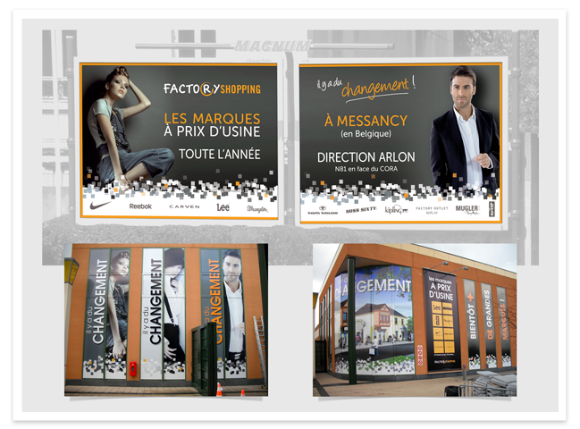
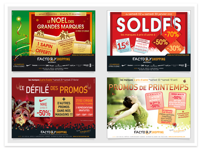
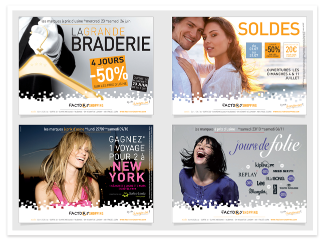
Factory Shopping / Mugler { flyer }
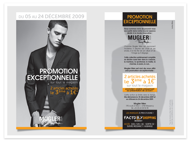
{ Designer Outlet / Boutique }
o Factory Shopping became in april 2011 McArthurGlen Designer Outlet Luxembourg.
o It was previously managed by Henderson Global Investors.
o Henderson is a leading independent global asset management firm.
o I was in charge of the designer outlet communication.
o Frequently I had also demands from stores in the center.
o Mugler Men took a boutique in December 2009.
o This is the promotional flyer I designed for their opening.
o The color scheme black/orange/white belongs to the center identity.
o Size of the flyer: 90 x 150 mm (about 3.5" x 6").
Nobilia / Eco Cuisines { mailbox leaflet }
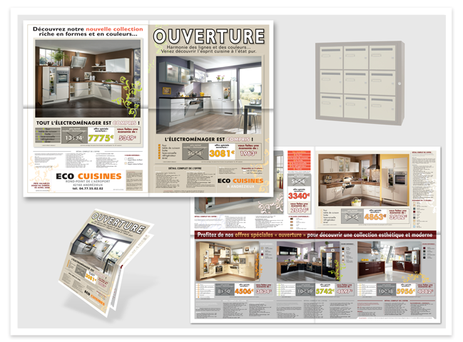
{ Kitchen Manufacturer }
o German Nobilia is the largest kitchen manufacturer in Europe.
o See more about Nobilia in the [catalog-booklet] section.
o Eco Cuisines is one of their French trade partner.
o This is a promotional leaflet I designed for a new store opening.
o Half fold then half fold, A2 landscape (594 x 420 mm), A4 folded.
o Opening information, new collection, technical description, good deals.
o Objective: make people visit the new store and trigger a decision to buy.
o Neutral background to bring forward the pictures and the prices.
o The touch of tonic color in each kitchen is echoed in its special offer.
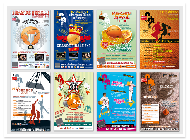
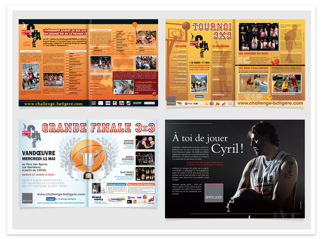
Batigère { invitations }
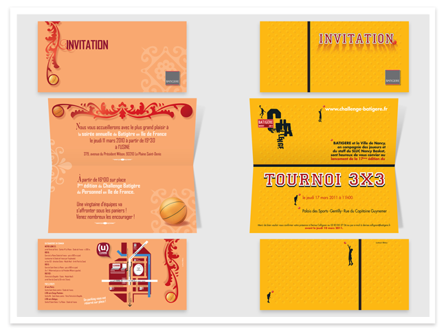
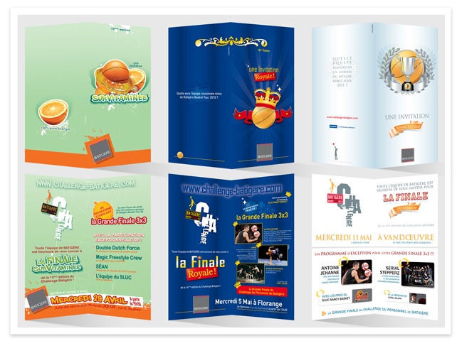
{ Street Basketball Tournament }
o See more about that major event promoting social cohesion in [poster] section.
o [top left] Invitation for an annual evening for Batigere Ile de France (Paris).
- Announcement of their 1st tournament (2010) following Batigere Sarel success.
o [top right] Invitation for the 3vs3 tournament opening in 2011.
- The texture of the ball inspired me that polka-dot pattern for the background.
o On the bottom, invitations for the finals of the 2009, 2010 & 2011 tournaments.
- Concepts: a high-vitamin event (09), a royal event (10) or a glorious event (11).
other simple prints { business cards }
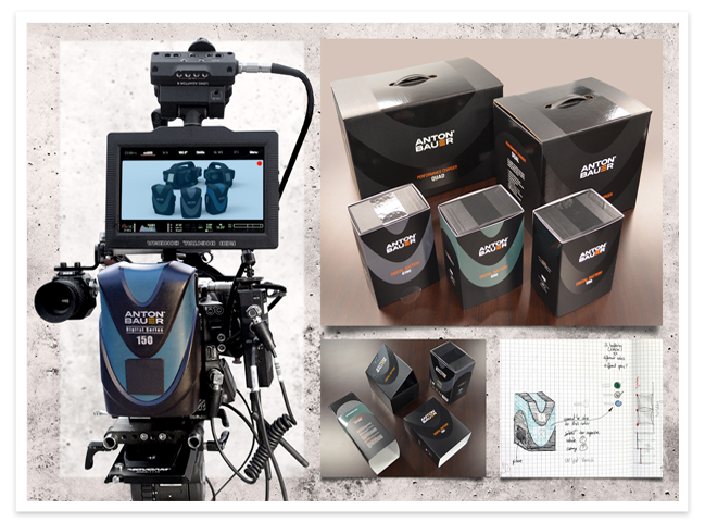
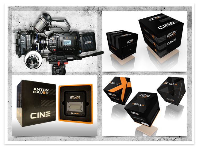
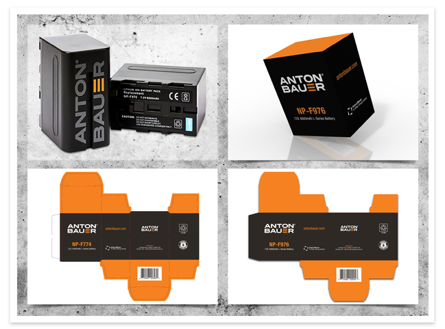
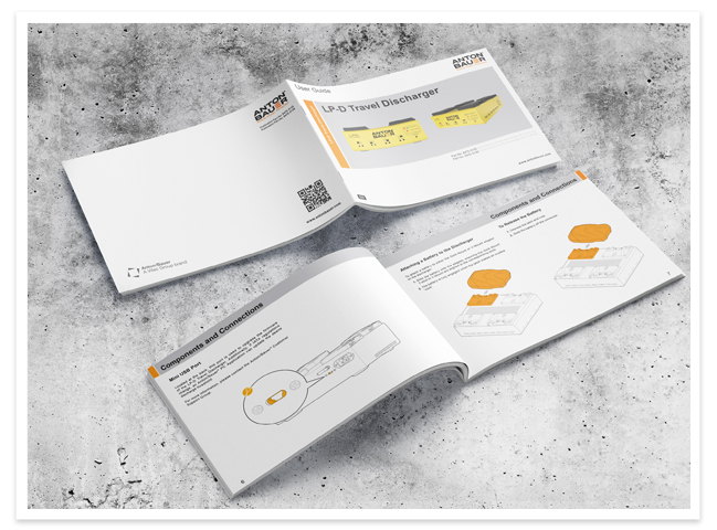
Anton Bauer { Battery Technologies }
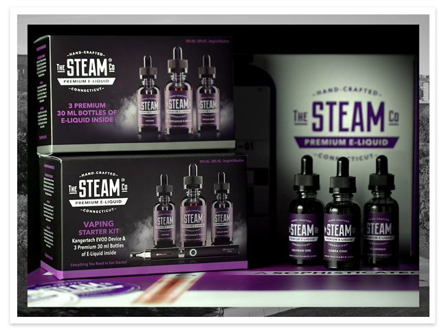
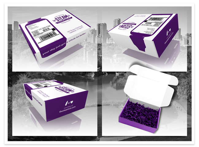
The Steam Co { Eliquid Brewery }
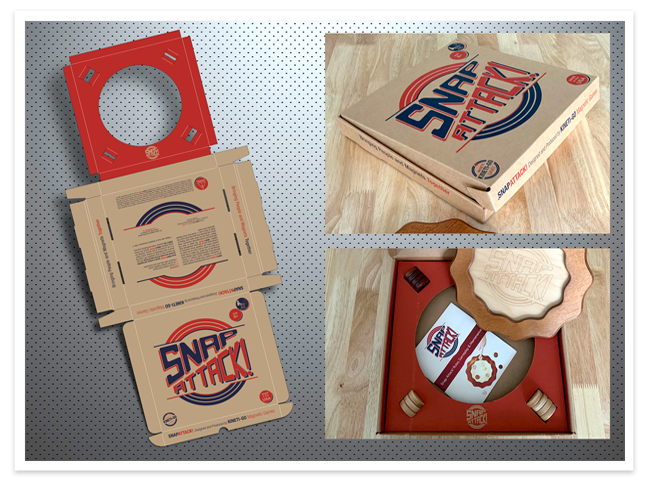
Snap Attack { Board Game }
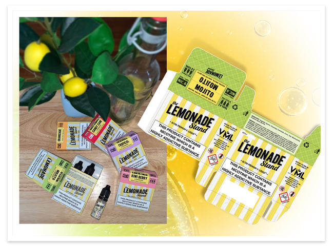
VML { Eliquid Packaging }
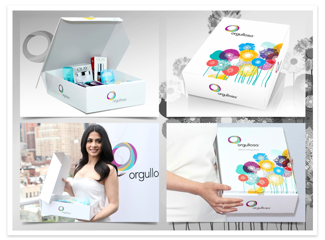
Orgullosa { Beauty Gift Box }
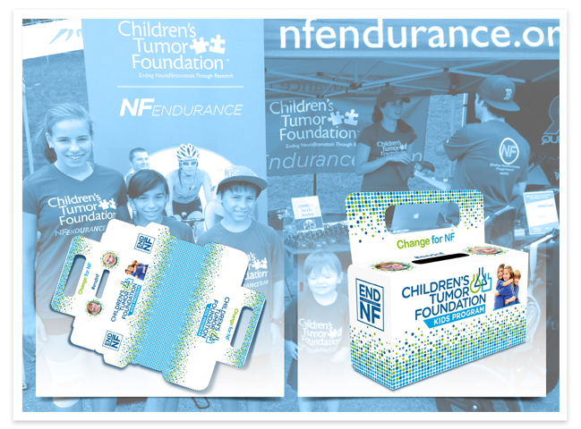
CTF { Corrugated Box for Donations }
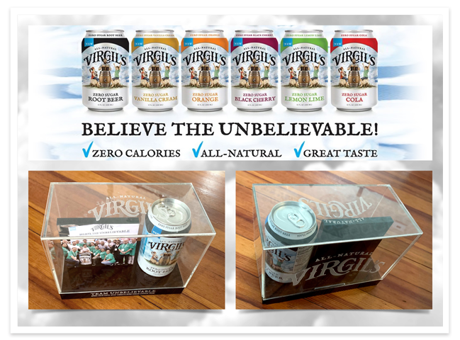
Virgil's { Commemorative Display Case }
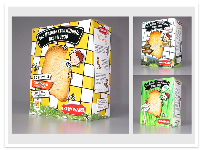
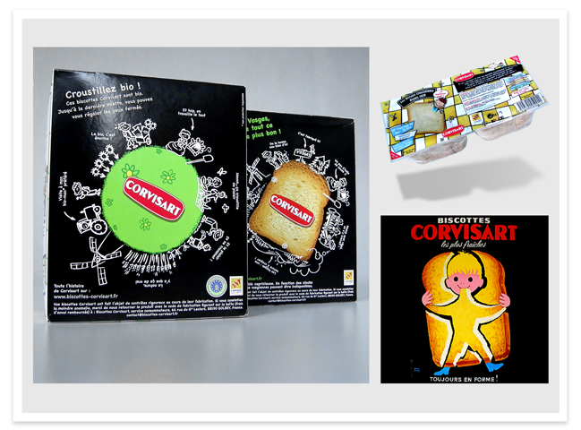
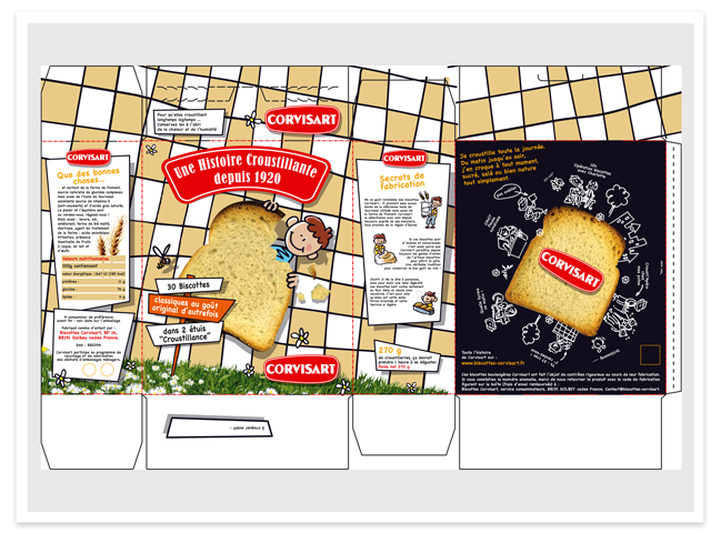
Corvisart { Rusks Manufacturer }
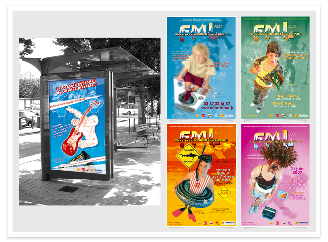
Conseil Régional de Lorraine { Highschool Music Festival }
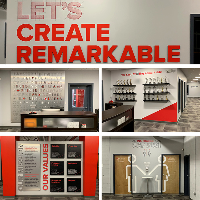
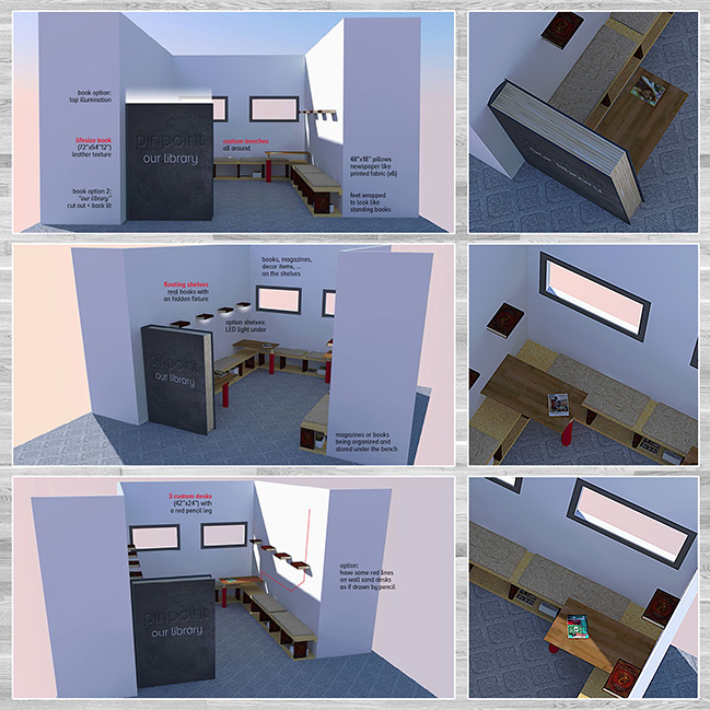
Pinpoint { Office Posters }
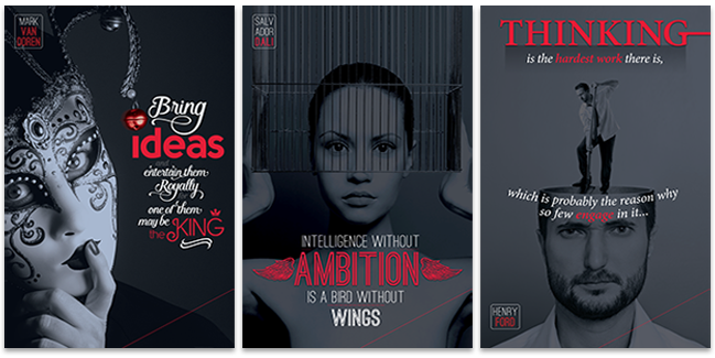
o Three posters part of a large collection created for the Pinpoint Offices in Stratford, CT.
o Request from a managing partner to create those to illustrate some motivational quotes.
o Use of brand colors, choice of relevant iconography, play with typefaces, interesting layouts.
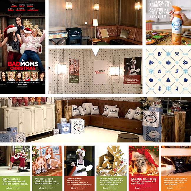
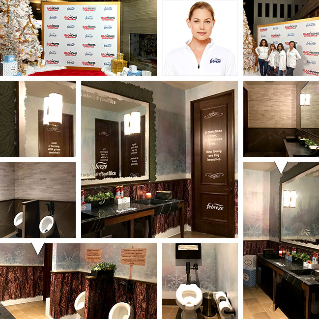
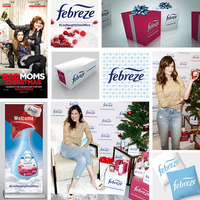
Febreze / A Bad Moms Christmas { Posters }
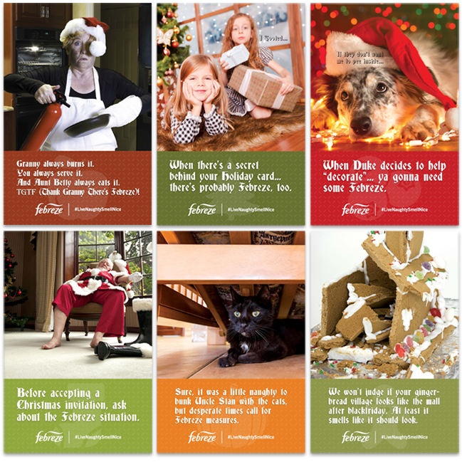
o Set of posters designed to illustrate the campaign #LiveNaughtySmellNice within a branded space.
o Please discover more about that branded environment in the following section [Branded Spaces].
o The layout (and keeping the copy over 3 or 4 lines) creates a nice consistency for the serie.
o Subtle icons in the background recall four Febreze scents (plus a stocking and a gingerbread man).
o The pictures also have a thread of consistency: a black element, for the naughty side (Santa's coal).
Westfield /CT Post Mall /Meriden /Trumbull { Mall Signage }
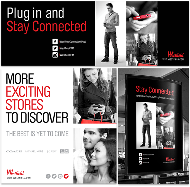
o On top: vinyl for barricade graphic promoting Westfield Malls social media presence.
o Lower left: vinyl creative for mall windows with announcement for new store openings.
o Lower right: snap frame poster advertising for the new social media content of the group.
o Stylish look & feel with use of black and white - brand colors - and conversion into the grayscale.
o Accents of red from the logo link the mall brand, shopping, and connecting to social media content.
Schimenti { Construction Site Signage }
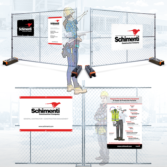
o 3'x2' mesh banner with logotype and 2'x3' site job sign (direct printed on corrugated plastic sheet).
o 5'x3' outdoor mesh banner with logotype (reinforced with hems and delivered with grommets to attach it).
o 5'x3' Company sign (direct printed on corrugated plastic sheet and finished with grommets) .
o 3'x5' PPE safety sign listing the requested equipment on site (corrugated plastic - direct print).
o Brand colors (red & black) plus gray used to differentiate English, Spanish and Polish on PPE sign.
{ more will be uploaded soon }
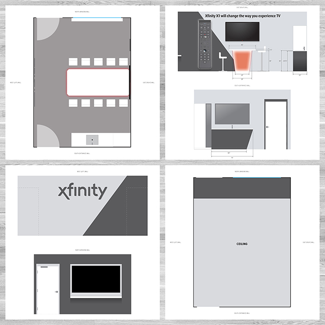
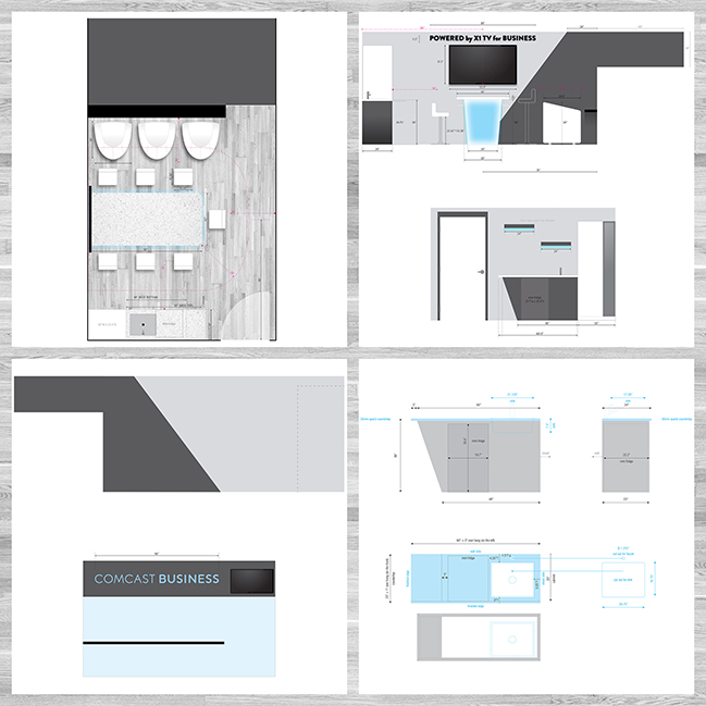
Xfinity { Branded Suite at Oakdale Theater }
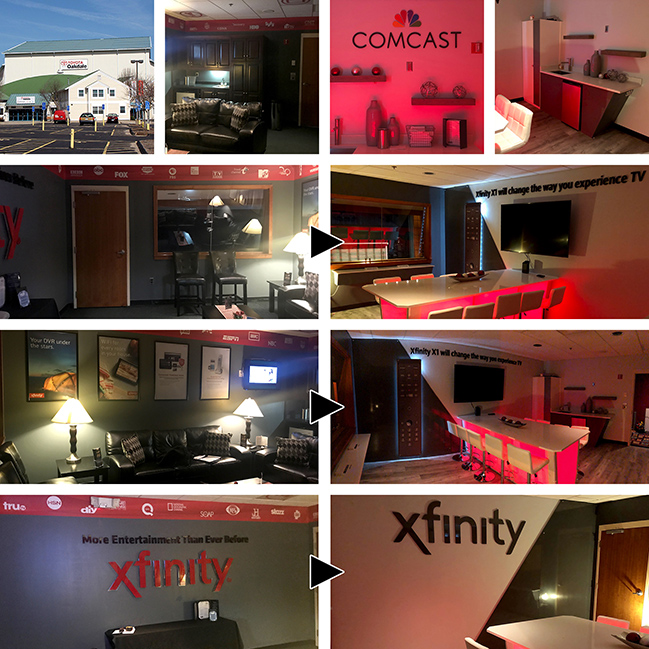
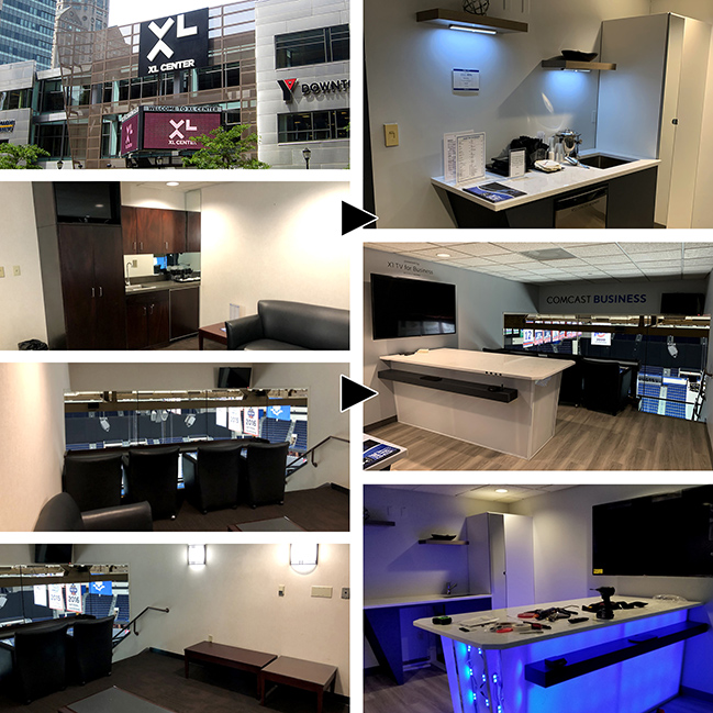
Comcast { Branded Suite at XL Center }
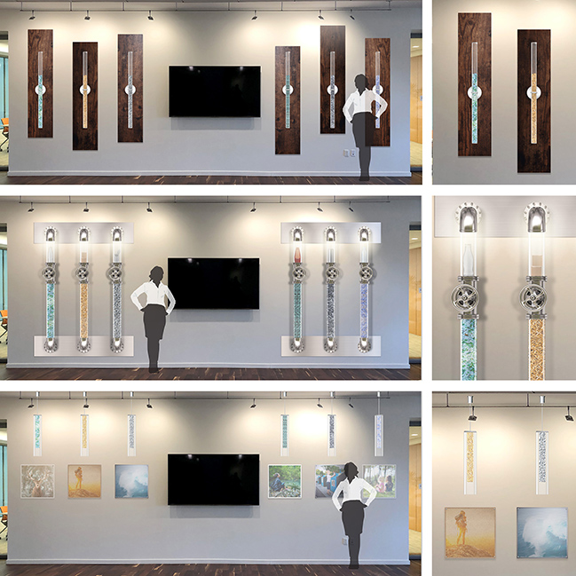
Pinpoint { Office Decor }
Van Dyk { Custom TV Wall }
Febreze { Movie Premiere After Party }
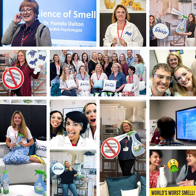
Febreze { Branding Media Day }
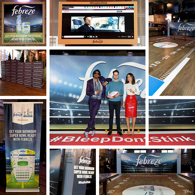
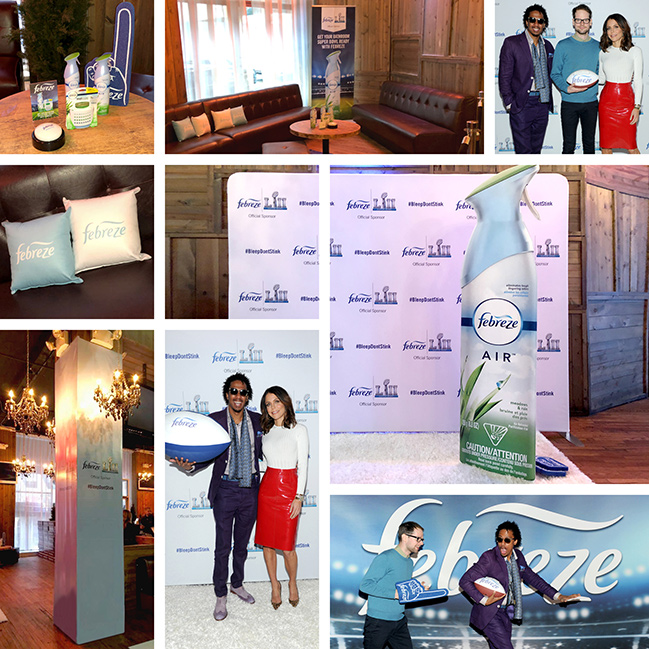
Febreze { Pre Super Bowl Soiree for Ad Campaign }
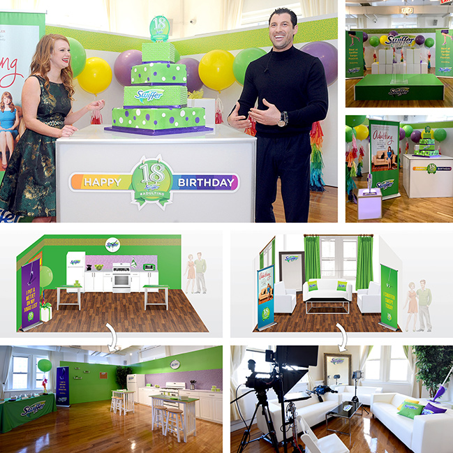
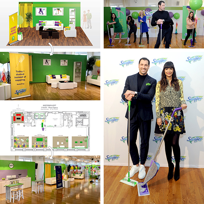
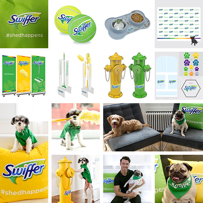
Swiffer { Media Event }
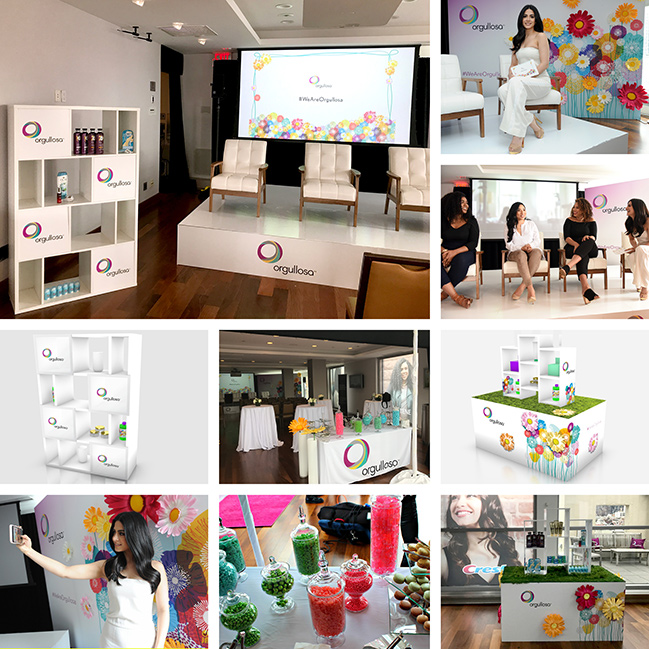
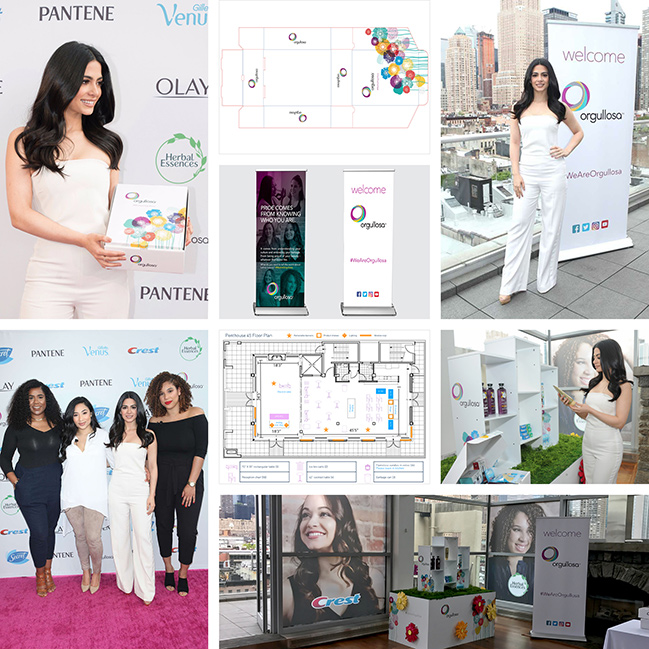
Orgullosa { Media Day Event }
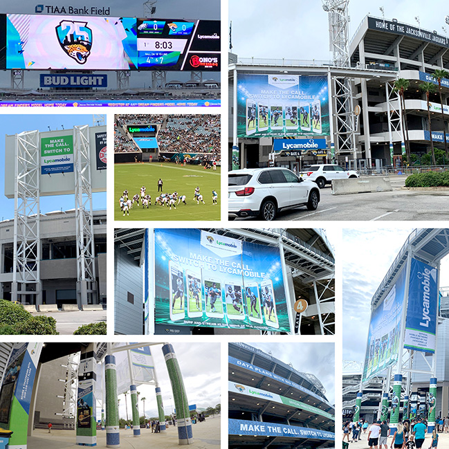
Lycamobile { Jacksonville Jaguars Partnership }
Swiffer { Media Event }
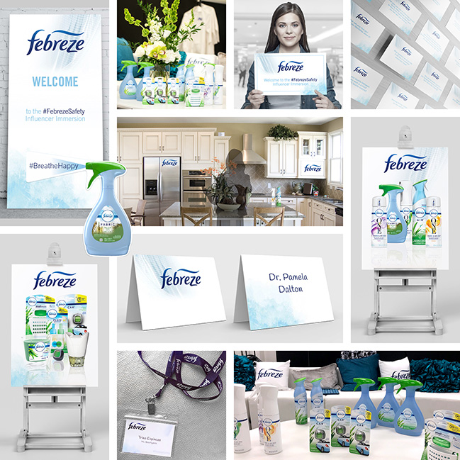
Febreze { Influencer Immersion }
Additional Mock-up Proofs
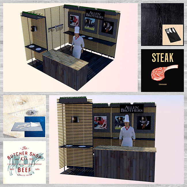
{ Allen Brothers / Trade Sow Booth }
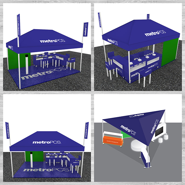
{ metroPCS / 6 Flags Footprint }
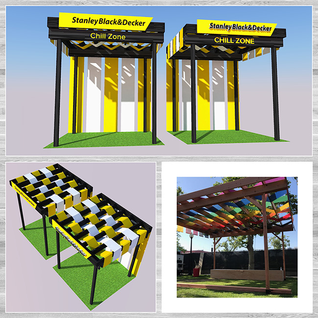
{ Stanley Black&Decker / Outdoor Booth }
{ Pinpoint / Office Decor }
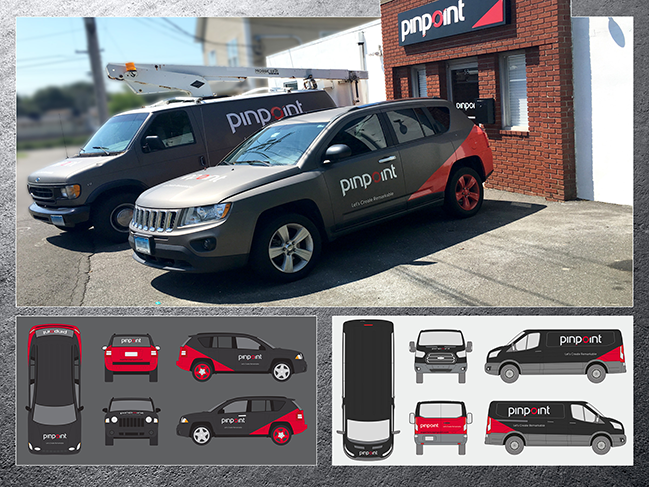
Pinpoint { Fleet Rebranding - Full Wrap }
Mastercard Priceless { Experiential Event - Custom Vehicle }
Black Rock Truck Group { Fleet Rebranding - Partial Wrap }
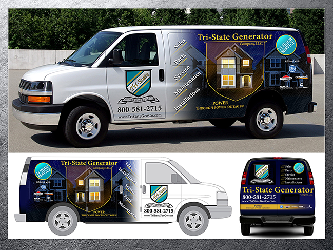
Tri-State Generator Co { Van Partial Wrap }
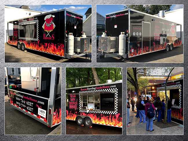
Roscoe's Traveling SmokeHouse { Food Concession Trailer - Full Wrap }
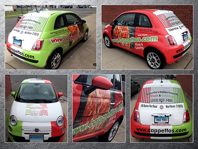
Cappetta's Italian Imports { Fiat 500 - Full Wrap }
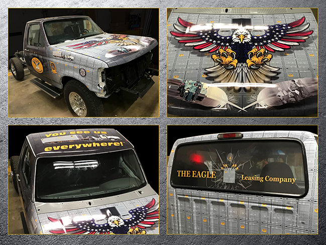
The Eagle Leasing Company { Vehicle Full Wrap }
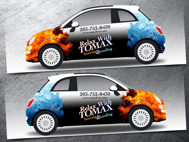
Tomax hvac { Fiat 500 - Full Wrap }
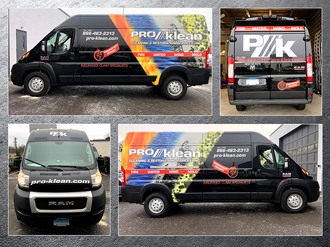
Pro-klean { Van Partial Wrap }
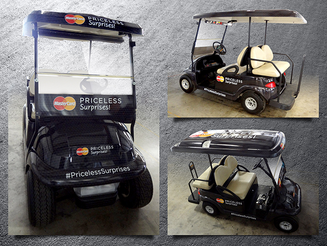
Mastercard Priceless { Golf Cart - Full Wrap }
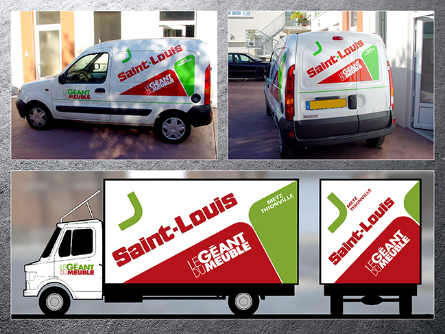
Le Géant du Meuble { Fleet Rebranding - Partial Wrap }
Factory Shopping { Designer Outlet }
Batigère { Street Basketball Tournament }
Conseil Régional de Lorraine { Highschool Music Festival }
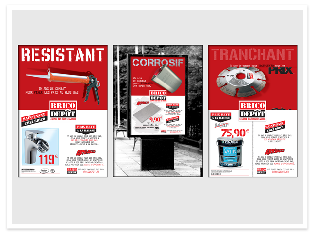
BricoDépôt { DIY & Home Improvement }
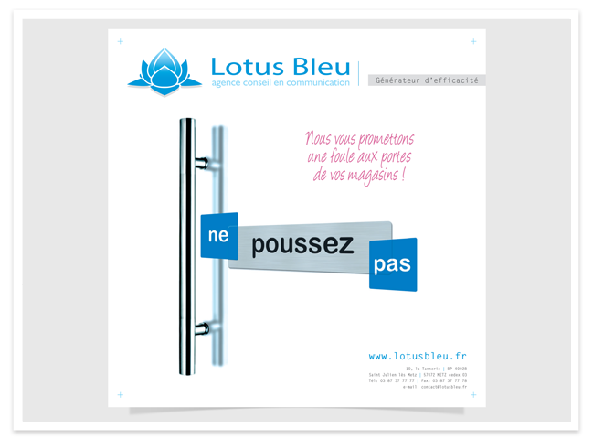
Lotus Bleu { Mar-Com Firm }
Factory Shopping { Retail }
Batigère { Non Profit }
Fidomes-Financo-BPLC { Finance }
Conseil Régional de Lorraine { political communication }
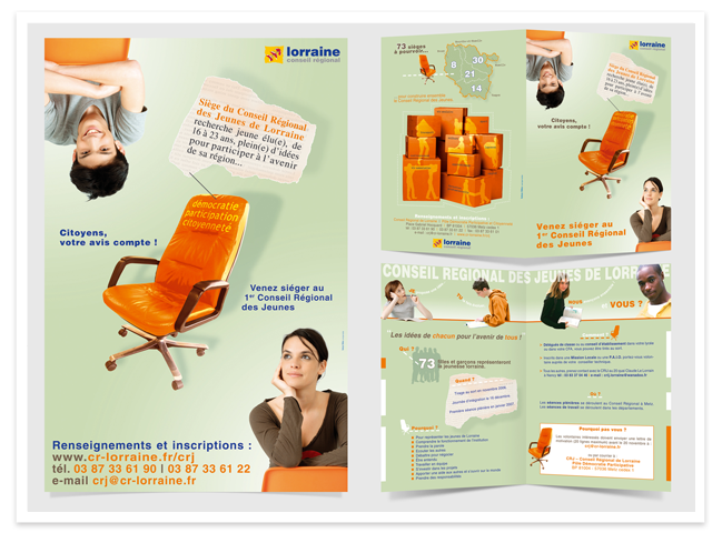
o Creation of the first Regional Youth Council of Lorraine (poster and leaflet).
o Concept: a classified ad placed by seats looking for young elected representatives.
o The leaflet conveys the following message: "everyone's ideas for the future of all".
o The idea of this council creation is reinforced by the picture with moving boxes.
o It underlines also the political projects the teenagers will have to think about.
o Dominant colour: green, hope for the future + tonic colour: orange, youth dynamism.
Val de Fensch { industrial heritage }
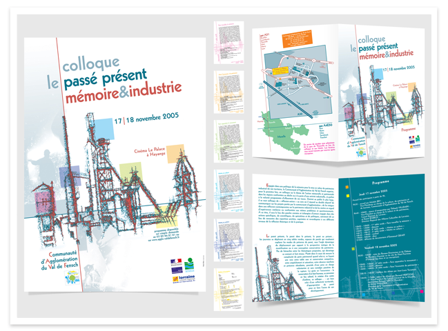
o "Symposium Past/Present, Memory & Industry" (poster, lealfet and slips).
o Conferences dealing with the future of an entire region and its steal factory.
o I draw the skyline of blast furnaces with trembling lines entwining.
o Concept: show the steal factory built by the life threads of hard workers.
o These workers, their children and grand children are worrying today.
o Red & blue, hot & cold steel, life & death, passion & emptiness, etc.
JHR { visitors’ programs }
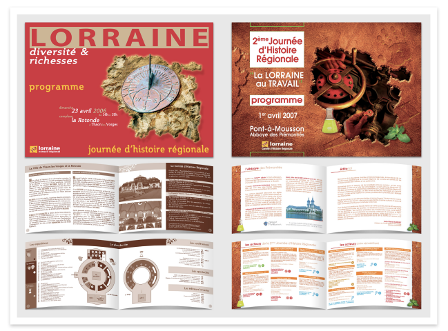
{ Regional History Day in Lorraine }
o 1st event promoting History in Lorraine that took place in 2006.
o Themes presented here: Wealth & Diversity in 2006, Labour in 2007.
o Layout for a traditional event program.
o 16 and 20 page pamphlets (8 x 5" close, 16 x 5" spread).
o Decided for a single spot color for the 1st one -brown- to instill an atmosphere.
o Chose a palette of earthy colors to achieve continuity in the 2nd one.
o Systematic use of the Lorraine map to create an identity.
o Design of icons or plans in the brochure used as signage in the site.
o Production of a range of information materials (posters, flyers, advertising, ...)
Bliesbrück Reinheim Park { archaeological exhibition }
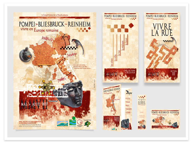
o Temporary exhibition drawing a parallel between the park and Pompei.
o Starting point to design the poster was a quote in the client's brief:
- “Movements of people, goods & ideas already characterized Roman times”.
o Use of Roman paved roads to underline the map, the goods, the ideas…
o Color scheme simply inspired by graffitis found on some Pompei walls.
o Poster, kakemonos for signage, press pack, bookmark, postal card, etc.
O.N.L. { music program }
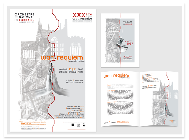
o Poster and booklet proposal for the National Orchestra of Lorraine.
o War Requiem, 1st performed in 1962: consecration of the new Coventry Cathedral.
o Silhouette of the ruins of St Michael’s Cathedral after WWII Conventry blitz.
o Left part ‘tortured’, filled: for the music, the notes and all sounds of war.
o Right one ‘peaceful’, empty: for silences, memories and quietness after fights.
o Hands: negative/positive, past/present, opposing in fight or joining in prayer…
Auralog - TellMeMore V6 { UI/UX Design }
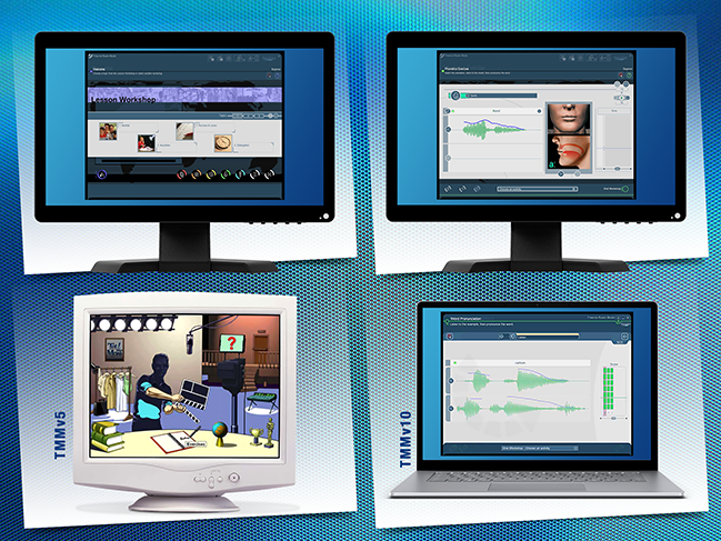
o For its 6th version, TellMeMore would deliver lessons not only in CDs/DVDs, but also via an online portal.
o Challenge: move away from Director used for offline rich media to Flash 5 with ActionScript to be web based.
o Necessity of a complete redesign for this language software: interface and navigation had to be re-thought.
o Like many DVDs at that time, interactions were playful (seeTMMv5). I wanted the design to be more timeless.
o Since the latest version was still showing the look and feel of v6, it must have been a successful solution.
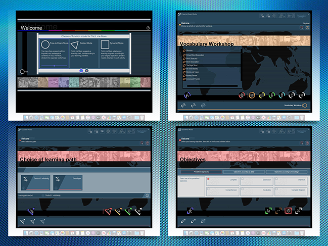
o Choice for the user between 3 learning modes: free-to-roam, guided, or dynamic that was a new v6 feature.
o Build architecture and set navigation through all what the software could offer (quite challenging).
o Find design solutions to guide the users through a lot of different types of informations.
o Need of a careful balance between new windows, menus, pop-ups, to stay on page or move to another one.
o To let the user know where he/she was at a given time (and how to go back) was as important as way finding.
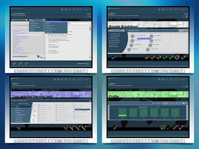
o A lot of levels to consider: input from the user, correction, key informations, additional details...
o Another difficulty: design with "containers" - and not the real words - linked to databases.
o Consider 5 level linguistic content for 9 languages avaialble in many display languages.
o Adapt to materials delivered into 6 workshops (reading, writing, listening, speaking, vocabulary, grammar).
o Need to find various ways to deliver the results and the progress of the users, adjusting to their needs.
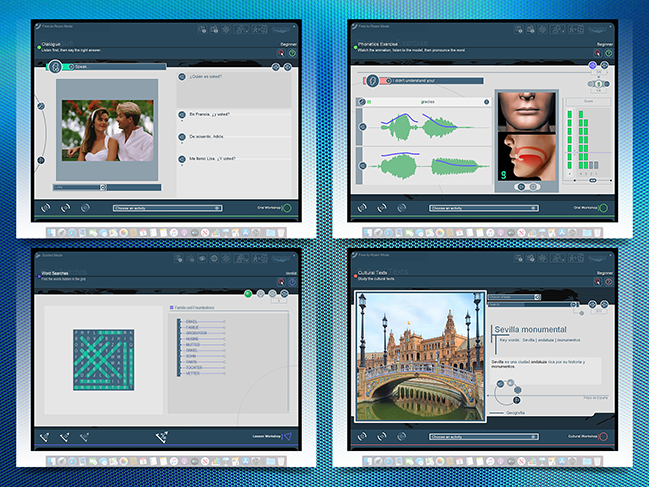
o Choice of dark blue background to avoid eye strain when staying in front of the screen.
o Balance with a complimentary color, a warm cream tone, also helping to focus on the exercise area.
o Choice of sleek icons and not buttons, colors used more for navigation than decoration.
o The goal was to create a real immersive experience for the users willing to learn a language.
o Besides the software graphics, I also worked in some programing parts for navigation and exercises.
Pinpoint { Website Architecture }
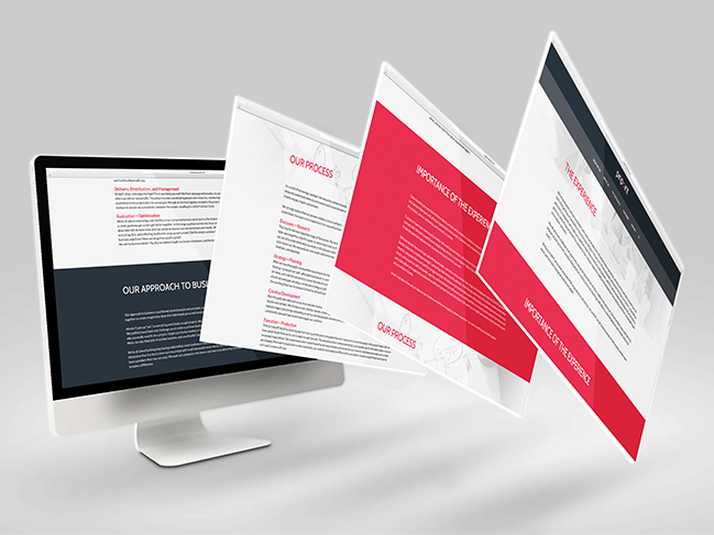
o I am not a web designer per se, but I can certainly offer expertise and direction for website mockups.
Diverse Clients { Email Pieces }
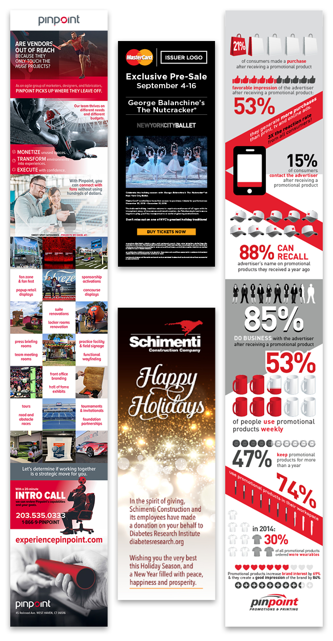
o Email related to Sports Sales Vertical to position Pinpoint as a vendor with that expertise.
o Email blast designed for Mastercard - CTA: buy pre-sale tickets for the Nutcracker.
o Ecard reaching clients of Schimenti Construction for the Holidays Season.
o Email blast to reach prospects within the Promotional Products Week in the form of infographics.
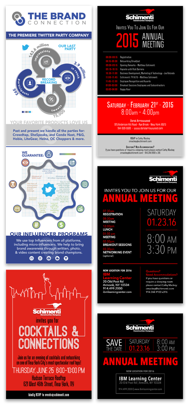
o Email blast for The Brand Connection with infographics advertising their Twitter Parties.
o Electronic invitation designed for Schimenti for one of their networking events.
o Electronic invitation for Schimenti Construction 2015 Annual Meeting.
o Electronic invitation for Schimenti Construction 2016 Annual Meeting.
o Ecard / Save the Date for the above meeting.
Schimenti { Infographics }
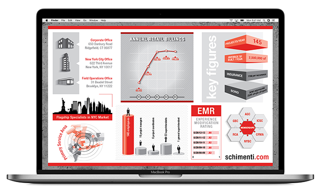
o Infographics designed for Schimenti Construction to be included into some of their digital presentations.
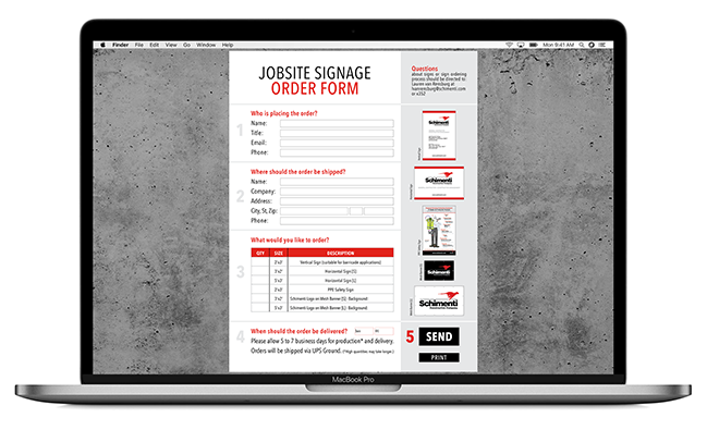
Schimenti { Digital Order Form }
o Digital Form - fillable PDF - designed for Schimenti to streamline their jobsite signage orders.